Here is my first magazine advert design..
How I made my Magazine cover..
I made my magazine cover using Adobe Photoshop as I have recently found myself becoming more confident with it, after making my digipak. I decided to use the same image from my digipak which featured on the back cover. I personally felt that it was important to have a picture of the artists on my magazine cover to get our faces, if we were a real band, well known. On the top right hand corner I put our logo of 'The Capulets' as this is our main signature design. On the top left hand corner I have placed a small company logo which I made on an online website. This allowed me to design and create my own, choosing specific font types and shapes, in this case I used lines. I wanted to keep it fairly simple as most of the company logos that I've seen pretty much are, such as the Universal logo. I also added a small HMV logo to show where our album would be available. I saw this idea on a number of different magazine adverts and so in order to make mine look professional I decided to also include it.
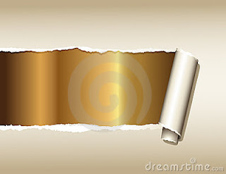
At first I was slightly worried about how I was going to put writing over the photograph and find a colour which wouldn't be overpowered by the image. However, I then had the idea of the ripped page effect. I went onto Google and found this image below..
I then manipulated it on Photoshop by erasing the middle section and filling it in with black, using the paint bucket tool. I then carefully erased the background colour leaving only the ripped section. I then adjusted its size to fit across our photo and put the text on top, using the same Lucida Calligraphy font as I used on my digipak. I decided to use a white font as it makes it clearer to read and also looks more professional against the black background, instead of using a brighter colour like pink for example, which may have made it look tacky.
For the 'Live on stage at 11:30' bit, I again used an online website to reconstruct a font which I had previously seen on the Nirvana poster, which said 'Live at Reading'. I thought it was a very eye-catching font, it looks as though someone has stamped it on, an effect which I personally found really effective. I think it also worked well with our electro pop genre which often uses a black and white colour scheme. I feel that this poster would attract a younger female audience as our logo is quite feminine with its twirly patterns and pink hearts. Also the fact that we are both young girls might aspire younger girls to look up to us.
I am really happy with my final result, I feel that I have managed to create a realistic looking music poster promoting our band, which also goes well with our genre and suits our target audience.
Here is my second magazine advert design although I personally prefer the first one..
In order to get the heart imagine in the background I took a screenshot from our music video, then manipulated it on Adobe Photoshop. I enhanced the contrast to make it stand out more and I then coloured the wave in white using the paintbrush tool, so that I could blend it into the white at the top of the canvas, giving me enough space to include the text, our band logo and our company logo.
I will be asking the class on Friday for feedback to see which one they feel is best suited for our band.


No comments:
Post a Comment